Home décor / Brand & digital direction
Nile Form
نيل فورم
A quiet, material-led identity for an imagined Egyptian home décor studio, connecting contemporary objects with a sense of place.
Fictional brand. The artwork is an illustrative design study; no client relationship or measured commercial outcome is claimed.
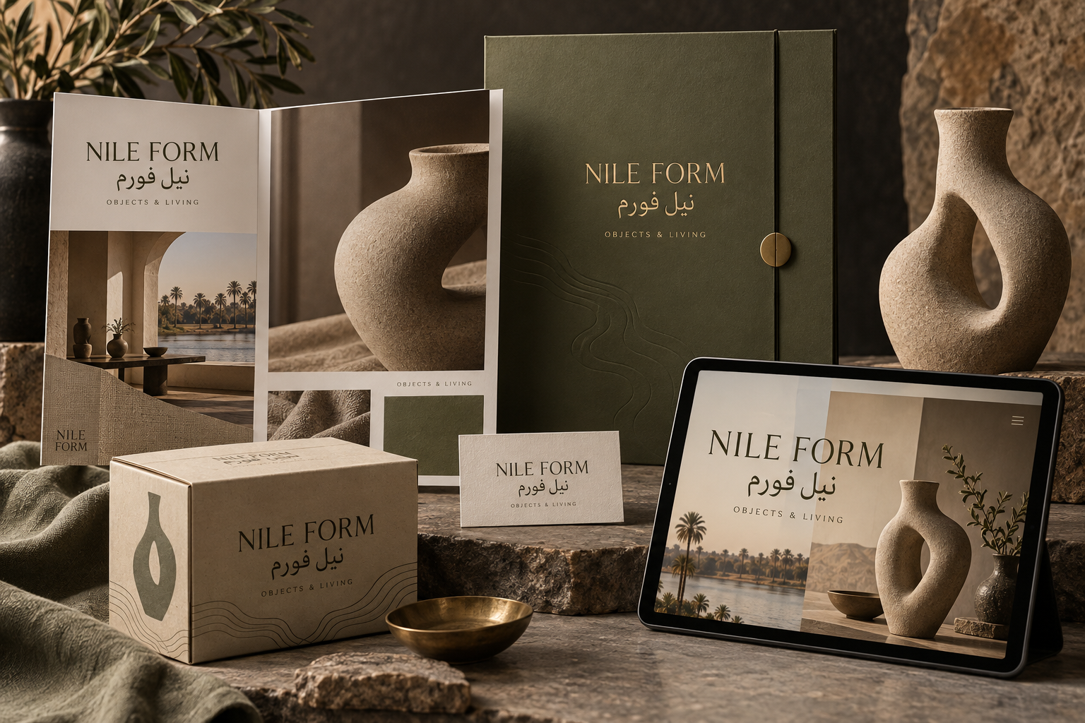
Editorial brochure, stationery, packaging and a digital mockup.
THE IMAGINED BRIEF
Who is it for?
The imagined audience values the character of an object: its shape, texture and relationship to a room. The brief is to create a considered presentation that feels editorial without making the product difficult to understand.
THE VISUAL DIRECTION
A system with character.
Olive, sand and charcoal echo natural materials. Restrained bilingual typography leaves space for sculptural ceramics and tactile photography. The design uses generous margins to keep the objects at the centre of the story.
Olive
#505A3C
Sand
#D5C5A7
Charcoal
#272723
THE EXPRESSION
A message in the brand’s voice.
An additional editorial copy direction, presented as a concept rather than an advertisement for an operating business.
Nile Form / CAMPAIGN COPY CONCEPT
Objects with character.
Room to breathe.
نيل فورم · Nile Form
THE APPLICATIONS
One identity.
Several moments.
The brochure develops the editorial world of the brand. Packaging and stationery reduce that world to a few consistent elements. The digital mockup explores a product-first visual direction; it is a concept image, not a functioning client website.
01
Identity
A name, colour system and visual language that remain recognizable across the study.
02
Physical touchpoints
Packaging and printed materials translate the direction into tangible brand surfaces.
03
Content potential
The same visual world can guide campaign assets, editorial themes and digital presentation.
THE NEXT DESIGN QUESTIONS
What a real project would test.
- Does the identity remain readable at small sizes and in different formats?
- Do the materials, production methods and digital layouts suit the intended use?
- Does audience feedback support the message and visual direction?
These questions belong to a real production and validation phase. The study demonstrates a direction rather than a completed commercial rollout.
LET’S BUILD
What could your brand
become?
Share your business, the challenge and what you want to change. We can use that to shape a useful first conversation.
↗