
Food / Identity & campaign
Hetta Baladi
حتة بلدي
An expressive Egyptian street-food concept built around familiar flavours, bold lettering and the energy of the street.
Fictional brand. The artwork is an illustrative design study; no client relationship or measured commercial outcome is claimed.
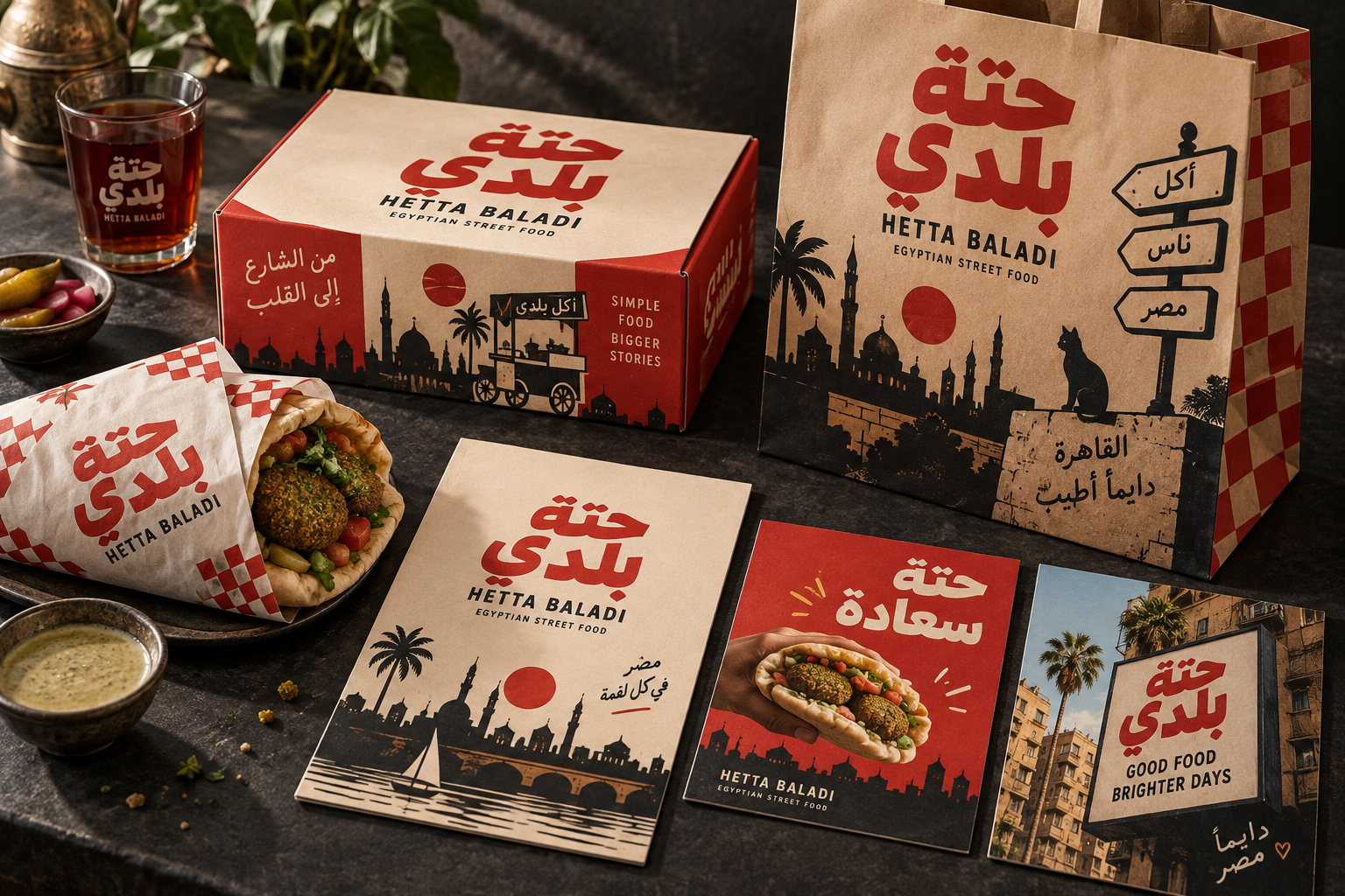
Takeaway packaging, a branded bag, menu and campaign cards.
THE IMAGINED BRIEF
Who is it for?
The imagined customer wants a quick, satisfying meal with personality. The concept needs to feel immediate and generous, with an identity visible on a takeaway bag and a message that can be understood in a passing glance.
THE VISUAL DIRECTION
A system with character.
Red and cream establish the dominant contrast. Bold Arabic typography becomes a central graphic element, while local street-sign cues add character. Photographic food moments balance the graphic identity with an appetite-led message.
Tomato red
#AC3023
Paper cream
#F0DFC1
Charcoal
#262521
THE EXPRESSION
A message in the brand’s voice.
An additional editorial copy direction, presented as a concept rather than an advertisement for an operating business.
Hetta Baladi / CAMPAIGN COPY CONCEPT
حتة سعادة.
من قلب الشارع.
حتة بلدي · Hetta Baladi
THE APPLICATIONS
One identity.
Several moments.
The bag acts as a moving brand surface. The box and wrap carry the same visual language at smaller scales, while campaign cards separate a clear headline from the food image so each has room to work.
01
Identity
A name, colour system and visual language that remain recognizable across the study.
02
Physical touchpoints
Packaging and printed materials translate the direction into tangible brand surfaces.
03
Content potential
The same visual world can guide campaign assets, editorial themes and digital presentation.
THE NEXT DESIGN QUESTIONS
What a real project would test.
- Does the identity remain readable at small sizes and in different formats?
- Do the materials, production methods and digital layouts suit the intended use?
- Does audience feedback support the message and visual direction?
These questions belong to a real production and validation phase. The study demonstrates a direction rather than a completed commercial rollout.
LET’S BUILD
What could your brand
become?
Share your business, the challenge and what you want to change. We can use that to shape a useful first conversation.
↗